
Tips for Choosing Calm Colors for Your Home

Choosing calm colors for your home can make rooms feel more comfortable, welcoming, and restful. The right shades can soften a busy space, improve the sense of flow between rooms, and create a pleasant backdrop for furniture and decor.
Calm colors do not have to be plain or boring. Soft blues, warm whites, gentle greens, muted grays, and earthy neutrals can all add character while keeping a room peaceful. The key is to consider how color works with natural light, room size, materials, and the mood you want to create.
Start With the Mood You Want
Before looking at paint samples, think about how you want each room to feel. A bedroom may benefit from quiet, comforting colors, while a living room may need a shade that feels relaxed but still lively enough for conversation.
Consider words that describe your ideal atmosphere:
– Peaceful
– Cozy
– Airy
– Warm
– Fresh
– Balanced
– Simple
– Restful
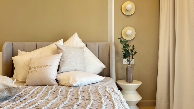
These words can guide your choices. For example, soft blue and green often support a fresh, peaceful feeling. Warm beige, cream, and light brown can make a room feel cozy. Pale gray can create a clean, balanced look when paired with warm materials such as wood or woven fabrics.
It is also helpful to consider how you use the room. A color that feels perfect in a quiet reading area may not suit a busy family room. Choose shades that match both the purpose of the space and your personal style.
Understand Warm and Cool Colors
Colors are often described as warm or cool. Warm colors include shades with hints of red, yellow, or orange. Cool colors include shades with hints of blue, green, or violet.
Warm and cool colors can both feel calm, but they create different effects.
Warm Calm Colors
Warm neutrals can make a room feel inviting and comfortable. Good options include:
– Cream
– Soft beige
– Sand
– Light taupe
– Muted terracotta
– Warm gray
These colors work especially well in rooms with limited sunlight or spaces that need a softer, more welcoming look.
Cool Calm Colors
Cool shades can make a room feel fresh, open, and restful. Consider:
– Pale blue
– Misty green
– Blue gray
– Soft sage
– Muted lavender
– Cool white
Cool colors are often a good choice for rooms with plenty of natural light. However, very cool shades can sometimes feel stark, so balance them with warm wood, natural fibers, or soft lighting.
Pay Attention to Natural Light
Light can change the way a color looks throughout the day. A paint shade that appears warm in a store may look cooler or darker in your home.
Observe the room at different times:
– Morning light may make colors appear brighter.
– Afternoon light can bring out warm undertones.
– Evening light may make some shades look deeper.
– North-facing rooms often receive cooler, softer light.
– South-facing rooms usually receive warmer, stronger light.
If a room receives little natural light, avoid choosing a color that is too dark or too gray unless you want a dramatic effect. Soft warm neutrals can help the space feel more welcoming.
In a bright room, gentle cool shades may provide balance. You can also use a slightly deeper version of a calm color if the space feels too open or washed out.
Test Colors Before You Commit
Paint chips are useful, but they are not enough for making a final decision. Color can look different depending on the wall, lighting, flooring, and nearby furniture.
Test your preferred shades in the actual room. Paint a large sample on several sections of the wall, or use large sample boards that can be moved around. Look at the samples during the day and evening.
When testing, ask yourself:
– Does the color still look pleasant in low light?
– Does it work with the floor and furniture?
– Does it make the room feel too cool or too warm?
– Does the shade look different on each wall?
– Does it support the mood you want?
Give yourself time to live with the samples. A color may seem appealing at first but feel too strong after several days. Testing helps reduce surprises and makes the final choice more confident.
Choose a Simple Color Palette
A calm home usually has a clear color relationship between rooms. This does not mean every wall must be the same color. Instead, choose a small group of shades that work together.
A simple palette might include:
– One main wall color
– One lighter or darker supporting shade
– A neutral trim color
– One or two accent colors
For example, you could combine warm white walls with soft sage accents, natural wood, and muted blue textiles. Another option is pale blue walls with cream trim, beige furniture, and touches of light brown.
Repeating colors throughout the home can create a sense of connection. You might use the same soft white in hallways and trim, then add different calm colors in bedrooms, living areas, or home offices.
Use Neutrals With Care
Neutral colors are popular because they are flexible and easy to live with. However, not all neutrals look the same. Beige, gray, white, and taupe each have different undertones.
A neutral with a yellow or red undertone may feel warm and comfortable. A neutral with blue or green undertones may feel cleaner and cooler. Look at your existing furniture and flooring before selecting a neutral. A gray wall can look blue beside certain floors, while a beige wall may appear more yellow near warm wood.
To keep a neutral room from feeling flat, layer different textures and tones. Add woven baskets, soft rugs, linen curtains, wood furniture, or ceramic accessories. Texture gives a quiet palette more depth without adding visual clutter.
Add Color Through Small Details
You do not need to paint every wall to bring calm color into your home. Smaller items are an easy way to experiment and make seasonal updates.
Try adding color with:
– Throw pillows
– Blankets
– Curtains
– Area rugs
– Artwork
– Vases
– Lampshades
– Plant pots
– Decorative storage
If you are unsure about a color, start with removable items. A muted green chair or soft blue blanket can help you decide whether the shade suits the room before you use it more widely.
Keep accent colors limited for a peaceful look. One or two repeated accent shades are often enough. Too many unrelated colors can make a room feel busy, even when each color is attractive on its own.
Balance Soft Colors With Contrast
A calm room still needs some contrast. Without it, the space may appear washed out or lack definition.
Use darker or stronger details in small amounts, such as:
– Dark wood furniture
– Black or bronze hardware
– Deep green plants
– Medium-toned rugs
– Natural stone
– Charcoal picture frames
Contrast helps lighter colors stand out and gives the room structure. The goal is balance rather than perfect matching. A pale wall, medium-toned furniture, and a few darker accessories can create a relaxed but finished appearance.
Consider the Whole Home
Finally, look beyond individual rooms. Calm colors work best when the home feels connected. You can create this effect by repeating certain shades, finishes, or materials.
For example, use a soft neutral in shared spaces, then introduce related colors in private rooms. Keep hallways and transition areas simple so the change between rooms feels natural.
When choosing colors, consider your furniture, flooring, window treatments, and lighting as part of the complete design. A paint color should support these elements rather than compete with them.
The best calm color is one that feels comfortable to you over time. Start with the mood you want, study the light, test your samples, and build a simple palette. With thoughtful choices, even subtle colors can make your home feel more peaceful, balanced, and inviting.
Related Post
How to Refresh Your Bedroom on a Budget
Give your bedroom a fresh, comfortable look without overspending using simple updates, smart styling, and [...]